lostprophetpunk
Members-
Content count
41 -
Joined
-
Last visited
-
Desktops Not Necessarily Aligned To One Particular Lunar Cycle!
lostprophetpunk replied to Emasher's topic in General Chit Chat
-
I have only just recently got into photography and thought I would try the new Photoshop CS5 hdr pro feature out, but because of my lack of experience (and also the fact that there isn't any good spots to shoot around where I live) I don't really know what makes a good photo. I have not really heard of the rule of thirds in photography (only web design). At the moment I am just practising as I would like some good photos for my portfolio. I was going to play around with the depth of focus etc, but I wanted to see if I could create a good hdr image first as I have only also recently got into playing with RAW settings in photoshop (even though I have been using it for 4+ years). Thank you for the tips and I shall have some more photos to come within the next week or so. The pictures were taken with a Nikon D40 that I borrowed from college.
-
I was just wondering...can anyone give me any feedback on any of my photography stuff? It should be in the last two or three pages.
-
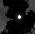
My first attempt at an hdr photo using CS5's HDR Pro feature....
-
Here are some attempts at some good photographs...(which are probably nothing compared to most on here)
-
Windows 7 is quite good compared to Vista...much quicker. I have Windows 7 on my laptop. I do like the taskbar and how it compacts the windows into just one icon. The annoying thing is though sometimes it is confusing when you want to go to a particular tab as it previews over hover. I do however like the snap feature as it provides good space when I am editing the css and html of my website designs. It also runs photoshop pretty well. I also rarely ever use the dock of programs at the top of the screen, which is much like the dock you would find on a Mac... I wish however I could still play Worms Armageddon on Windows 7 as it's for Windows 98/XP.
-
Here is another image I have done...
-
Rate the Above Poster's Avatar and Signature
lostprophetpunk replied to Smalldude76's topic in General Chit Chat
Avatar - 9/10. Sig - 8/10. Love the way it's constructed. -
Paj, thanks for the feedback. I was looking to improve the magazine ad (as well as the other two) anyway, I just wasn't sure what needed changing. Chairdriver, thanks for the feedback. I would do it with a model...but it is a college project so we do not have access to those kind of resources. I also agree with the A6 flyer criticism about the text, as it made me think about it. Retro Link, thanks for the feedback. I did originally thing (looking at the design overall) that the A4 magazine ad really wasn't that good. I really like the idea of looking inside the bottle and seeing a party. For the A3 poster, the bottle and the glass I can lighten up, as the reflections I did for the grass faded them out a bit. I wanted the feedback due to my individual ideas reaching their limit and having a bit of an idea block.
-
Heya there, I have recently completed some designs for a college project I have been working on. The links to the three designs will be provided below. The designs are for an A4 magazine advert, an A6 flyer and an A3 poster. Before you take a look at the designs, I must mention that these have been scaled down for preview and none of the sizes represent the actual sizes. What I would like you wonderful members to do is to provide some feedback on the designs, such as what could be improved or what needs to stay etc. A4 Magazine Ad A6 Flyer A3 Poster Thank you, Matt.
-
I have only recently started doing some photography stuff, as we are doing a few assignments on it at the moment. I started to get a bit creative, so here is one of the images attached to this post.
-
Thanks for the feedback Chris. I may be converting it to a wordpress theme, if I have the time.
-
I only have the CSS on the page as I only do it for making a mock up of the design. Once I have coded the rest of the website, then I will use external style sheets. The portfolio page will incorporate a php gallery designed by myself. I shall be leaving the design for a day or two, and then coming back to it. As this is how I improve the design. I come back after a day or two and then I will be able to see if anything points out to me etc. I didn't want the site to be based on typography too much as I didn't want to go for a minimalistic look.
-
It's ok. On most websites you have to scroll down etc. It's mainly due to me working on a laptop so not getting a huge resolution for designing. I wanted to code it in HTML 5 as it is the latest HTML format out. The reason why I said that the HTML 5 and the CSS is valid, as this is something that it is important when creating a professional design. I am however, looking to code a full website as I am wanting to use this for my new design.
-
That would be as it is just the design, so the links do not actually have a target, but are there for the use to see how they would hover etc.